Nihonga
Nihonga, translating to "Japanese painting," was a term first coined in 1882 for a way of painting that was intended to preserve the traditional Japanese style of art. Nihonga began when Japan opened its trade borders for the first time in over two centuries. In response, Japan's society experienced a push toward modernity during a time known as the Meiji Period. Nihonga artists wanted to combat Japan's adoption of Western artistic styles. Nihonga is still practiced today, the style experienced a revival in the 1980s.
Nihonga is based on Japanese painting traditions that are over one thousand years old. Traditional Japanese works had a matte finish that resembled watercolor. Brushstrokes were not apparent, and line was emphasized. Nihonga utilizes only traditional materials like sumi ink (made from the soot of burnt lamp oil or pinewood, animal glue, and perfume) and kofun (chalk). The artists did add a modern twist, however, by broadening the range of subject matter and incorporating some aspects of Western art like chiaroscuro and one-point perspective.
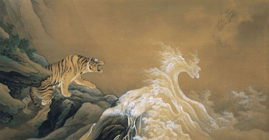
Dragon Against Tiger by Hashimoto Gahō
(c. 1899).
Color on silk. Japan.
The focus of this painting is a Tiger standing on a rocky outcropping confronting a dragon in the clouds (upper right corner). In the middle are white and translucent foaming waves, which feel as if they are being controlled by the dragon. Both tigers and dragons are
mythical symbols of Japanese culture; the tiger is often associated with kings of the earth while the dragon is associated with emperors of heaven. It seems then that this confrontation is meant to depict the supremacy of heaven over earth.
Japanese paintings traditionally utilized line to create strongly outlined forms, as is done here with the rocks and dragon. The tiger, however, is more naturalistic in style than would typically appear in traditional Japanese paintings, partly due to the realistic color choice and form. This painting also has a depth that traditional works lack, as the scene seems to open up behind the tiger.
I'm neither religious nor particularly spiritual, so the confrontation between earthly kings and heavenly beings does not mean much to me, but I love the drama of this painting. It does feel like a moment of tension between two great beings. I also love the soft style of painting. There is not a lot of color used, and the colors present are somewhat muted, but the painting still conveys emotion very well.
Peacock Displaying His Wings by Shoko Uemura
(c. 1983) Japan.
This work represents the traditional Japanese style by focusing on a single bird that inhabits much of the composition and leaving the background blank. The technique of leaving blank space is known in Japan as
yohaku no bi. In Japan, the peacock was connected to
Kannon, a god who looked upon the suffering of the world with compassion. This is reflected in the peacock's many "eyes" within his tail feathers.
This painting is simple, with just a peacock as the subject, yet elegant and interesting. The bright colors stand out against the blank space, and the green and gold blend effortlessly. Without a background, the viewer focuses solely on the feathers and it becomes mesmerizing. The feathers form a cloud of color around the bird, except for the triangle shapes at the very ends. I enjoy that this painting is meditative and subtly colorful.
Color on silk. Japan.
This work features a lone tabby cat, turning towards the viewer as it reaches to groom itself. The cat is caught in an amusing pose, with vibrant green eyes looking back. This work draws on the popularity of cats in Japanese
Ukiyo-e prints (woodblock prints).
Like the peacock above, this work utilizes blank space in a way similar to traditional Japanese works. The coloring of the cat makes it look realistic, which is a technique drawn from Western art. Almost the entire painting is comprised of different tones of golden brown. I'm partial to this painting because I love cats. I think it is especially enjoyable because the cat is in a position that normally would not be featured in a painting, but anyone who has been around a cat knows this can be a common movement. I love that the green eyes are intently looking at the viewer like a cat might in real life.
References
"Nihonga Movement." The Art Story, https://www.theartstory.org/movement/nihonga/.
"What is Nihonga Art and its History?" Bruvel Fine Arts, https://www.bruvelfinearts.com/pages/what-is-nihonga-art-and-its-history
"Yohaku no bi: The Beauty of Empty Space." Seattle Japanese Garden, https://www.seattlejapanesegarden.org/blog/2016/03/15/yohaku-no-bi-the-beauty-of-empty-space


Hi Lacey, I enjoyed all the pictures you chose. I especially liked the Dragon against Tiger painting. I like that those are two very powerful animals. I like how Hashimoto used the earth and air elements and integrated them together. I also understand he also adopted western elements with the use of the negative space. Very beautiful and interesting artwork you have chosen!
ReplyDeleteI was excited to see that for your non-western blog, you chose Nihonga art as your theme, which happens to be the art movement that developed in opposition to Yōga art, which I chose for my blog. From your presented artwork
ReplyDeleteTabby Cat by Takeuchi Seihō (ca. 1924) is my favorite, so much so that I even considered covering Nihonga art in my blog. The feline portrait, which is said to result from a cat in Numazu City, Shizuoka Prefecture, is a masterpiece that displays the pet midst motion, cleaning itself, and casting a sudden look at the viewer with emerald green eyes. The soft, airy background masterfully accentuates the delicate cat figure.
Takeuchi Seiho painted not only cat portraits; animals were his forte. The artist kept animals such as rabbits, monkeys, ducks, and cats at home to observe them and create his marvelous sketches.
Hello Lacey,
ReplyDeleteI really like this first one and would like to have it in my home. I like the way the waves look as though they are on fire, and in that fire is a dragon appearing oblivious to the tiger at his/her back. The uplifting motions of the curves in the waves make the dragon appear fierce and possibly angry because something disturbed his slumber. The tone of the sky against the golden waves with their white tips seems to be bursting out of the water. Dragons are one of my favorite things that can be found in art from Japan. Although the tiger appears just as fierce, the dark tones of the rock outcropping make it less prominent than the dragon.
I am not fond of the colors the artist used for the peacock. The pale yellow with the olive green in its feathers is a little boring to me. While it is a fine painting, I prefer the use of a deep blue, green or even white for peacocks.
I like the tabby cat painting and the way the artist left abundant open space around it. It makes the cat more prominent with its beautiful brown and white coat and bright green eyes. I would not have this painting in my home as I lean more towards Victorian era art.